EM PH Contact

Social media app · Mobile · 2 weeks

A social app built around creators.

A dark, photo-first social app: discover posts by topic, follow stories, and see a creator's reach at a glance.

Krishom SharmaWeek 1 · The brief

Discover, follow, and see a creator’s reach at a glance.

UX and UI design.
A dark, photo-first social app: discover posts by topic, follow stories, and see a creator's reach at a glance.

Krishom SharmaWeek 1 · Discover
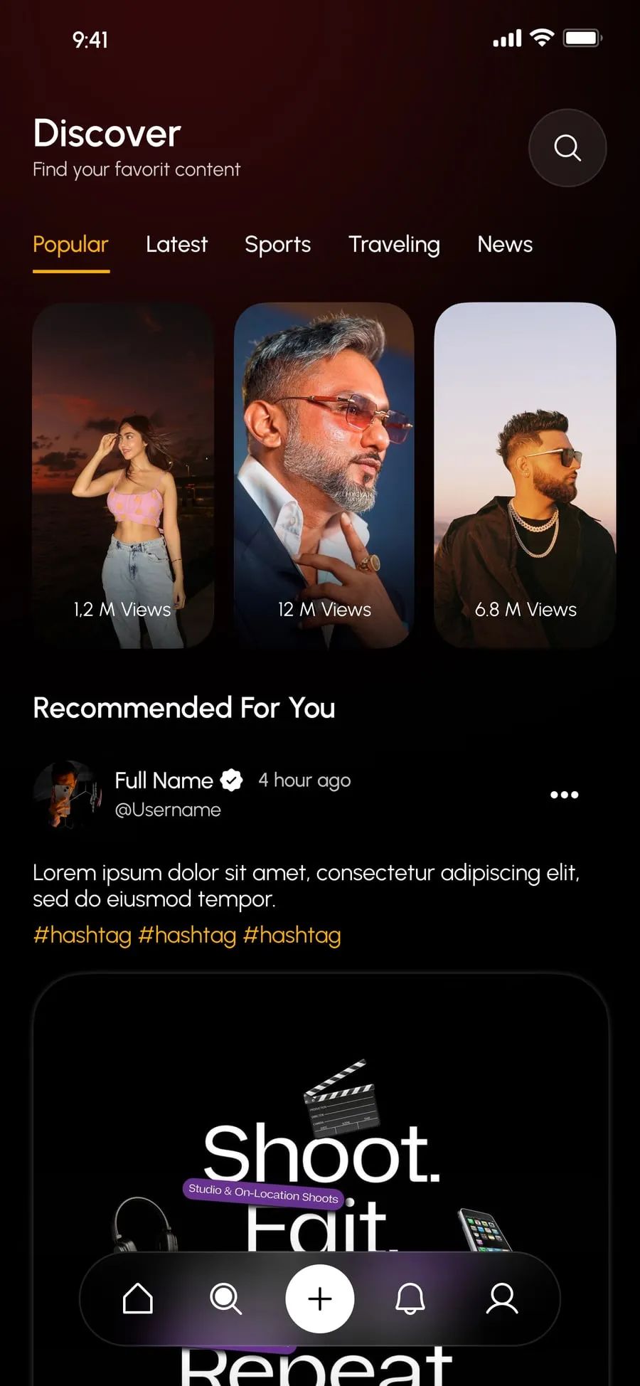
Discover screen: topic tabs, trending reels with view counts, and recommendations
Discover screen: topic tabs, trending reels with view counts, and recommendations — close-up

Discover

Discover sorts content into Popular, Latest, Sports, Traveling and News, leads with trending reels and their view counts, and follows with recommendations.

  • Popular
  • Latest
  • Sports
  • Traveling
  • News
Krishom SharmaWeek 2 · Home
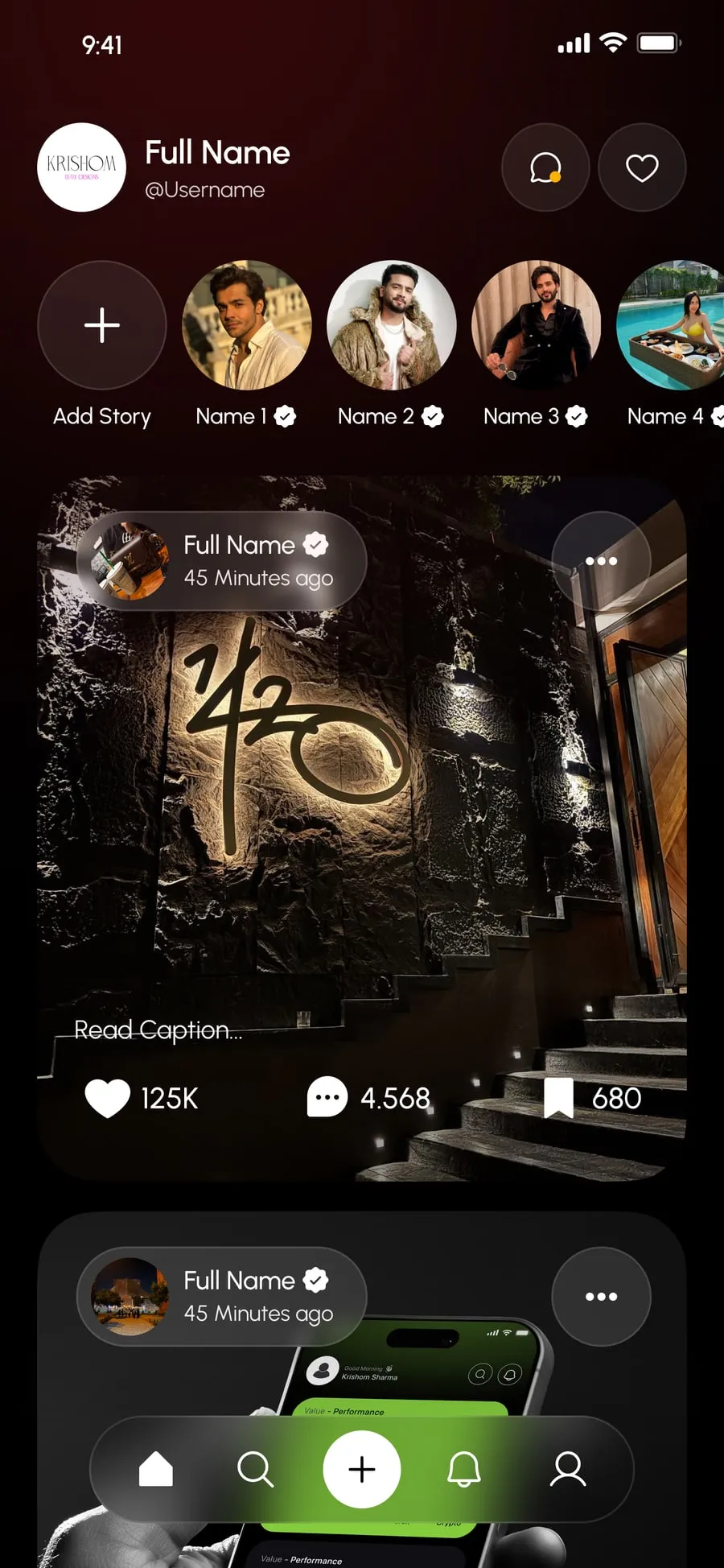
Home screen: a row of stories, then a feed of posts with likes, comments and saves
Home screen: a row of stories, then a feed of posts with likes, comments and saves — close-up

Home

Home opens on a row of stories and a feed of posts with likes, comments and saves.

Krishom SharmaWeek 2 · Profile
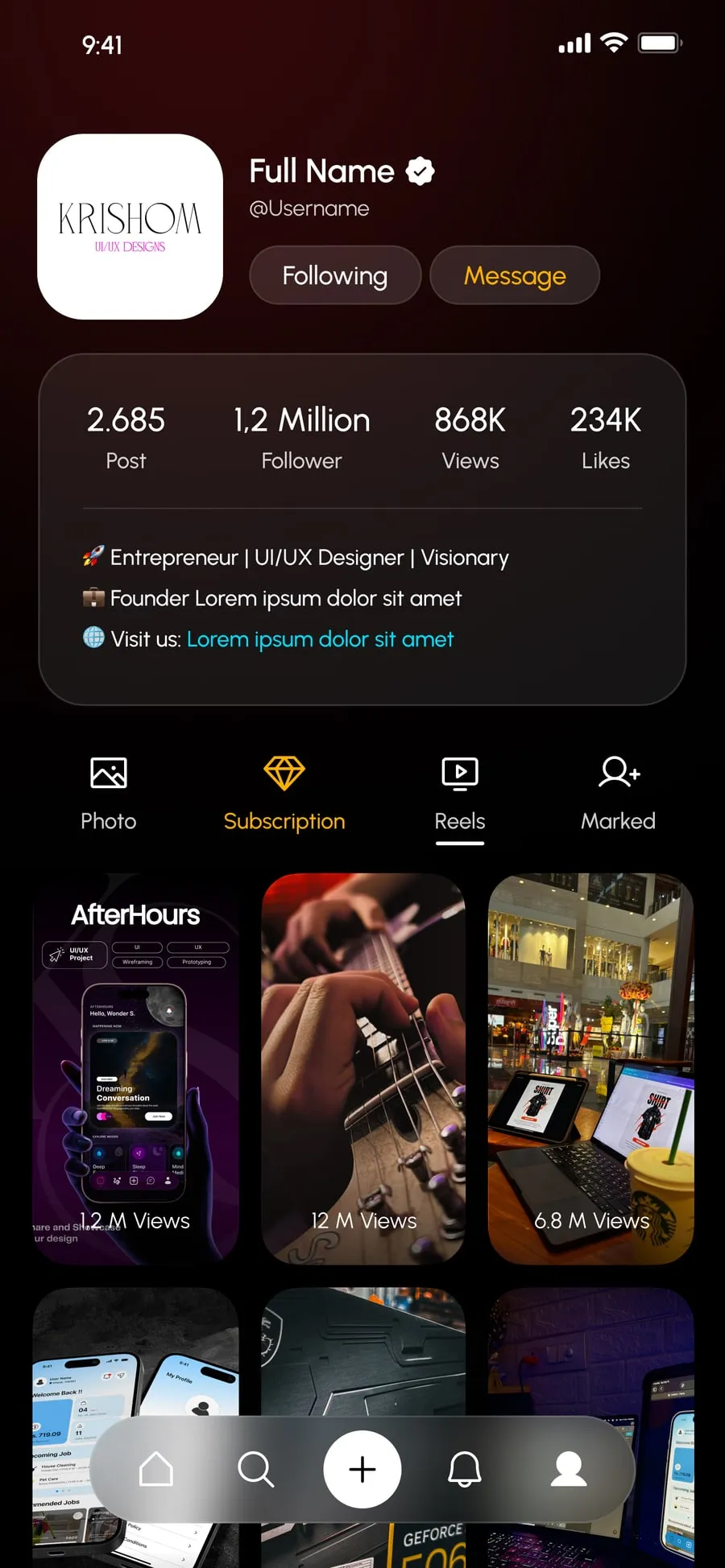
Profile screen: posts, followers, views and likes in one card, with photos, subscriptions, reels and saved items
Profile screen: posts, followers, views and likes in one card, with photos, subscriptions, reels and saved items — close-up

Profile

A creator's profile puts posts, followers, views and likes in one card, with photos, subscriptions, reels and saved items one tab away.

Krishom SharmaWeek 2 · The look

Dark, photo-first, with creating always in reach.

A floating bottom bar keeps creating a post at the centre.

✓ You’re all caught up

UX Design · UI Design — Krishom Sharma

Message me

The UX work

Behind the design

  • From the build — read off the real screens
  • Assumption — to validate with users
  • Planned test

From the build

  1. 01

    Discover is organised by topic tabs (Popular, Latest, Sports, Traveling, News) before anything else.

    WhyBrowsing by interest is faster than searching when people don’t know exactly what they want.

    Discover

  2. 02

    Every trending reel shows its view count on the thumbnail.

    WhyA quality signal before the tap — people choose what to watch, rather than gamble.

    Discover

  3. 03

    Home opens on a row of stories, then the feed, with likes, comments and saves counted on each post.

    WhyStories are the quickest catch-up; counts help people decide what to engage with.

    Home

  4. 04

    A creator’s reach sits in one card — posts, followers, views and likes — with Following and Message as the two main buttons.

    WhyThe two decisions on a profile are “is this person worth it?” and “what do I do next?”

    Profile

  5. 05

    A floating bottom bar keeps Create (+) at the centre.

    WhyCreating is the action the platform depends on; the centre is the easiest place for a thumb.

    Every screen

  6. 06

    A dark, photo-first palette with one warm accent.

    WhyPhotos and reels carry the colour; the interface steps back.

    Every screen

Assumption — to validate · The browser, on a spare ten minutes

Stage1Open2Explore3Watch4Check the creator5Follow
DoingOpens the app on HomeSwitches to Discover and picks a topicPlays a trending reelOpens the creator’s profileFollows or messages them
Thinking“What’s new from people I follow?”“Show me travel”“Is this worth my time?”“Is this person worth following?”“I want more of this”
Feeling
positivepositiveneutralpositivedelighted
PainStories and posts competing for attentionSearch needs you to know what you wantNo signal of quality before tappingReach is invisibleFollow buried in a menu
Design responseStories row first, then the feedTopic tabs — Popular, Latest, Sports, Traveling, NewsView counts on every reel thumbnailPosts, followers, views and likes in one cardFollowing and Message as the two main buttons

Proto-personas — built from the brief, not from interviews

  • The creator

    Posts reels and photos, and wants to grow an audience

    Wants
    See their reach at a glance and post quickly
    Frustrated by
    Stats buried in separate dashboards
  • The browser

    Follows topics — sport, travel, news — more than people

    Wants
    Find good content in their interests fast
    Frustrated by
    One endless feed with no way to steer it

From the build — the information architecture as shipped

  • Home
    • Stories
    • Feed — likes, comments, saves
  • Discover
    • Popular
    • Latest
    • Sports
    • Traveling
    • News
    • Recommended for you
  • Create (+)
    • New post
  • Notifications
    • Activity
  • Profile
    • Stats — posts, followers, views, likes
    • Photo
    • Subscription
    • Reels
    • Marked

From the build — key flows, screen by screen

From topic to creator

  1. 1Discover
  2. 2Pick a topic
  3. 3Trending reel
  4. 4Creator profile
  5. 5Follow or Message

Catching up

  1. 1Home
  2. 2Stories
  3. 3Feed
  4. 4Like, comment or save

The validation plan — how each assumption gets checked

  1. We believePeople find content in a given topic faster with topic tabs than with search.

    MethodTask-based test, tabs vs. search, 5 participants each

    We’ll know byTime to first relevant reel

  2. We believePeople read a creator’s reach correctly from the stats card.

    Method5-second test on the profile

    We’ll know byShare who recall followers and views correctly