
Luxury fashion e-commerce · 3 weeks
Elegance, redefined.
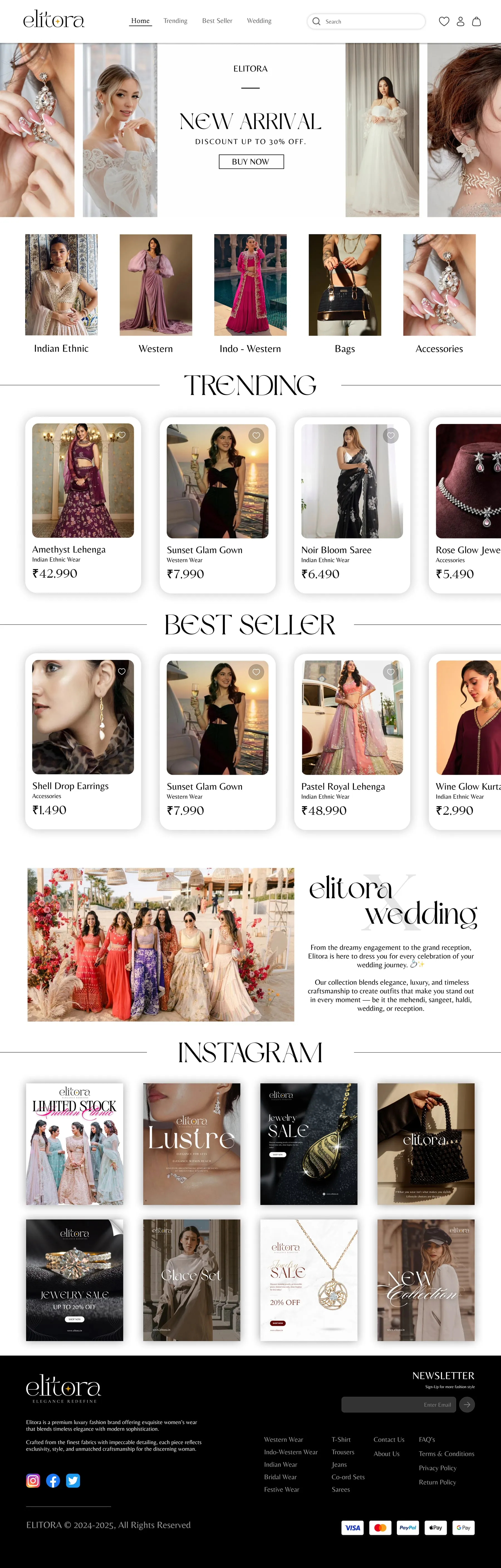
An online store for a premium women's-wear label — Indian, bridal, festive, Indo-western and western wear — with the home page designed in light and dark.
The runway · 5 looks
Five pages, walking past.
-
Look 01 · Week 1
Home, in light
New arrivals first, then categories, trending, best sellers, the wedding edit and Instagram.
-
Look 02 · Week 1
Home, in dark
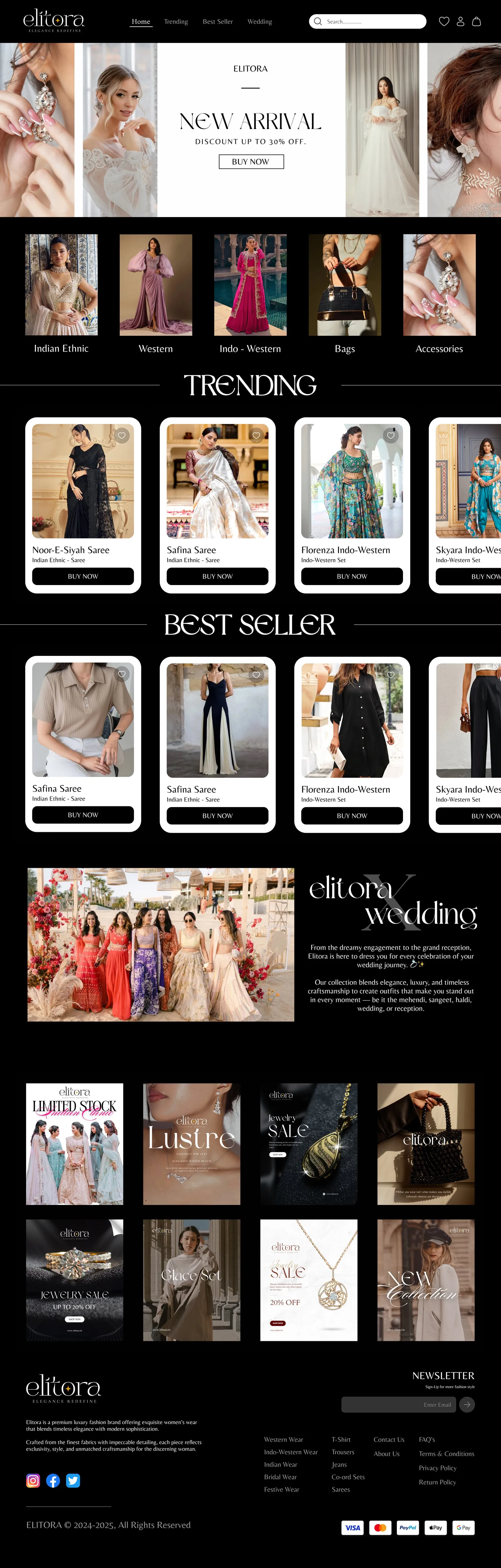
The same home page, carried into a dark theme.
-
Look 03 · Week 2
Trending
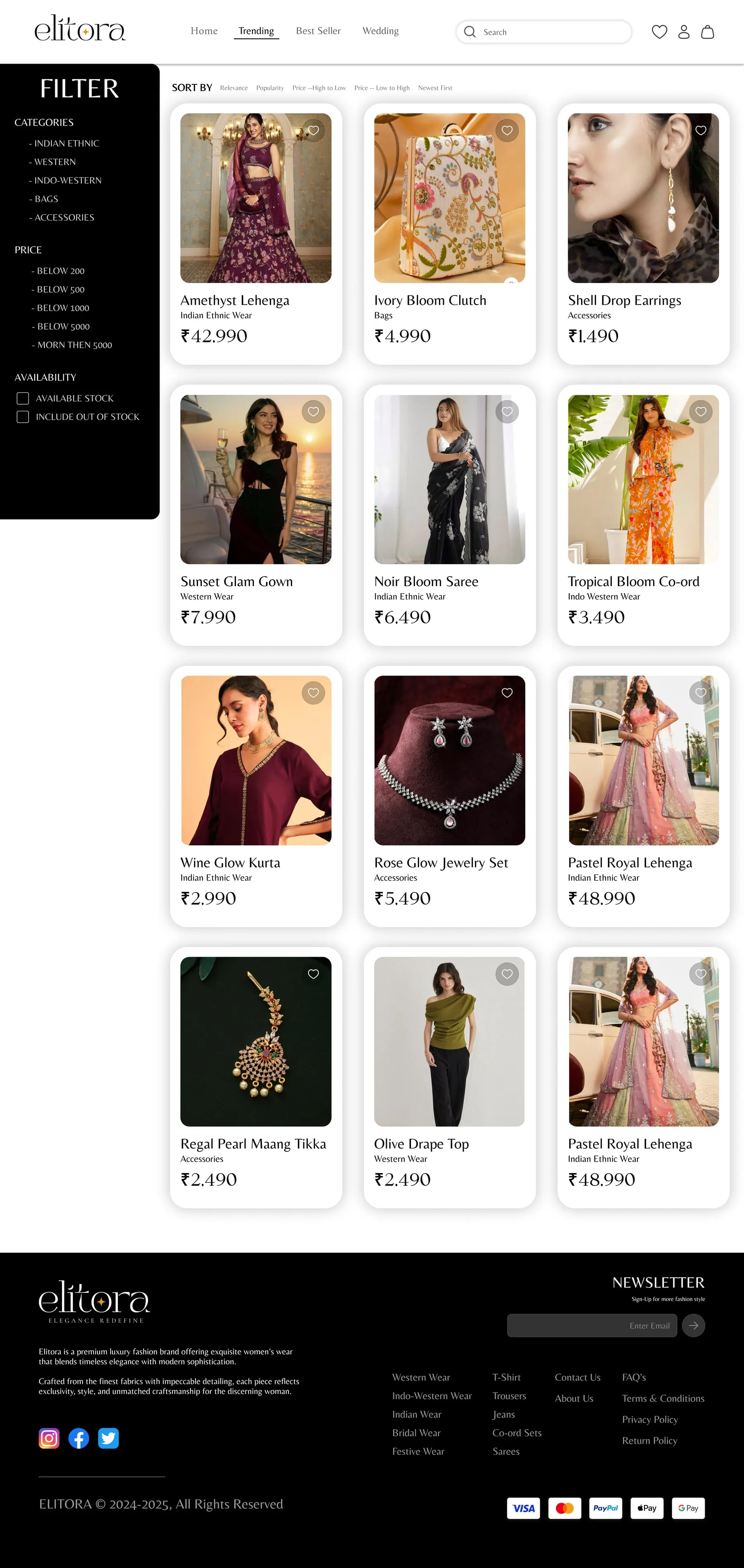
A filter panel — category, price, availability — beside sort options for relevance, popularity, price and newest.
-
Look 04 · Week 2
Best sellers
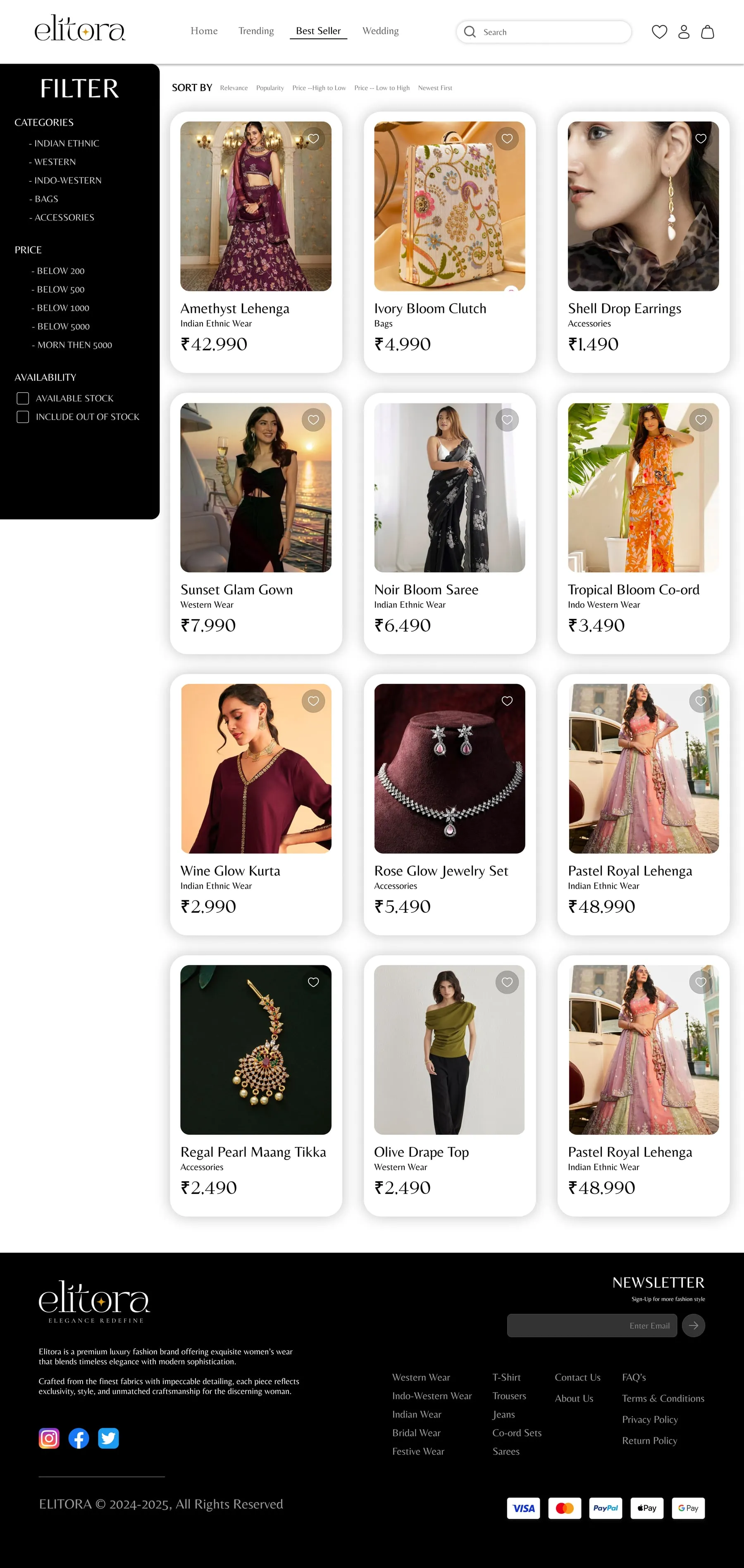
Product cards kept to image, name, category and price.
-
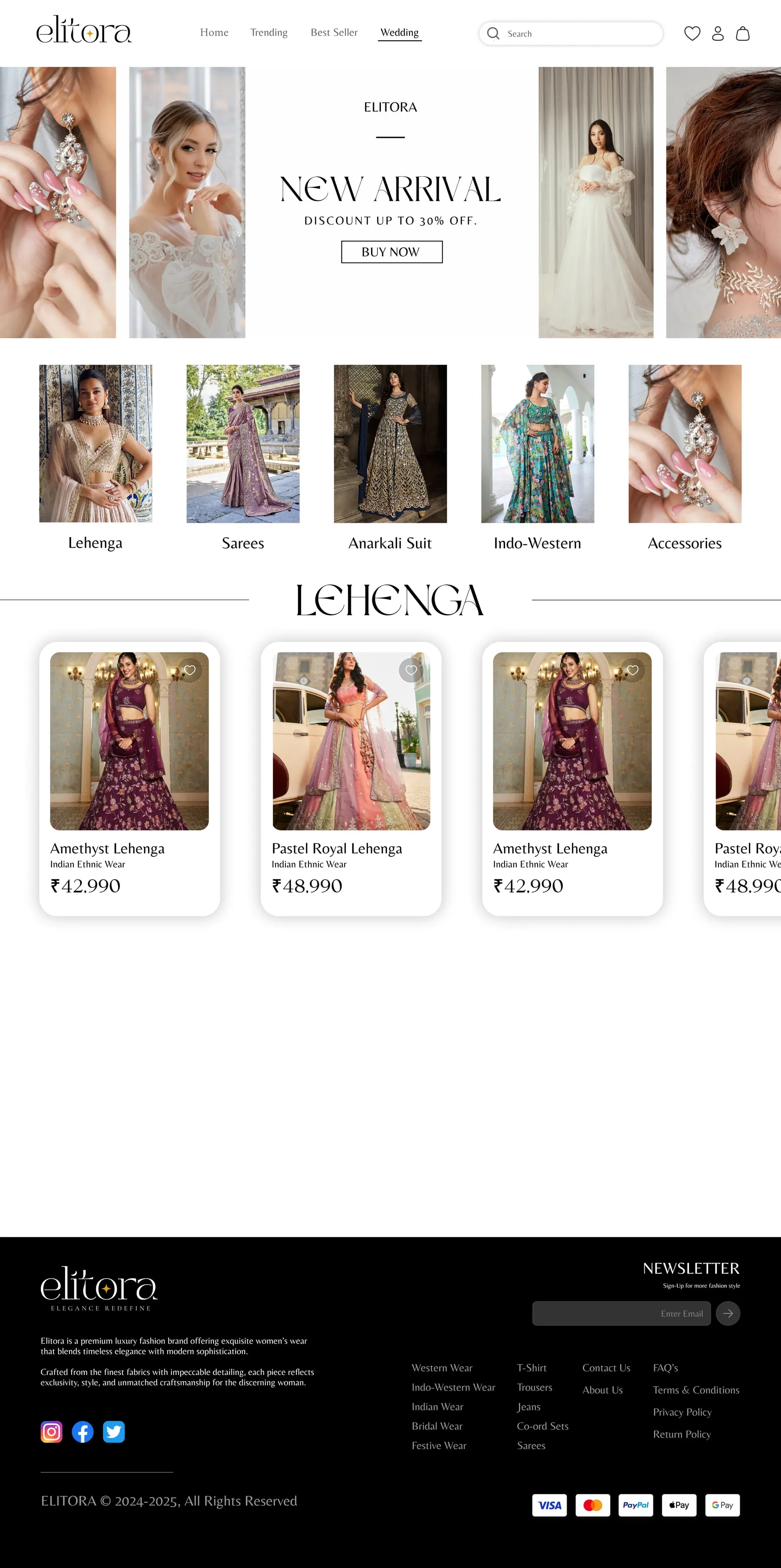
Look 05 · Week 3
The wedding edit
The bridal collection, gathered on its own page.
The UX work
Behind the design
- From the build — read off the real screens
- Assumption — to validate with users
- Planned test
From the build
- 01
The top navigation is just Home, Trending, Best Seller and Wedding.
WhyFour doors that match how people shop luxury — what’s new, what’s popular, what’s for the wedding.
Header
- 02
The home page is designed in both a light and a dark theme.
WhyLuxury fashion photography changes character on dark backgrounds; offering both lets the clothes lead.
Home
- 03
Listings pair filters (category, price, availability) with sort (relevance, popularity, price, newest).
WhyNarrowing by what is available prevents falling for something that can’t be bought.
Trending · Best Seller
- 04
Product cards keep to image, name, category and price.
WhyIn luxury, restraint reads as quality; the photo does the selling.
Every listing
- 05
Wedding is a page of its own.
WhyBridal is the highest-intent shopper; she shouldn’t have to dig.
Wedding
Assumption — to validate · The bride-to-be
Proto-personas — built from the brief, not from interviews
-
The bride-to-be
Shopping for wedding and reception outfits
- Wants
- See the whole bridal edit in one place and narrow it quickly
- Frustrated by
- Bridal wear scattered across generic category pages
-
The festive shopper
Buys a few statement pieces a year
- Wants
- See what’s new and on offer, then buy with confidence
- Frustrated by
- Busy product cards and endless scrolling
From the build — the information architecture as shipped
- Home
- New arrival
- Categories
- Trending
- Best seller
- Wedding edit
- Trending
- Filters — category, price, availability
- Sort — relevance, popularity, price, newest
- Best Seller
- Filters and sort
- Wedding
- The bridal collection
- Categories
- Indian Ethnic
- Western
- Indo-Western
- Bags
- Accessories
- Header
- Search
- Wishlist
- Account
- Bag
From the build — key flows, screen by screen
From browsing to the bag
- 1Home
- 2Wedding
- 3Filter and sort
- 4Product
- 5Wishlist or bag
The validation plan — how each assumption gets checked
-
We believeShoppers find a bridal outfit under a set budget in under two minutes.
MethodModerated test, 5 participants shopping for a wedding
We’ll know byTime on task; filter use
-
We believeShoppers prefer the dark home page for evening and bridal wear.
MethodPreference test, light vs. dark
We’ll know byPreference and reasons given
Finale
The details, kept quiet.
Five pages. The home page opens on new arrivals, then moves through categories, trending pieces, best sellers, the wedding edit and the brand's Instagram — designed in both a light and a dark theme. Trending and Best Seller listings pair a filter panel (category, price, availability) with sort options (relevance, popularity, price, newest), and a Wedding page gathers the bridal collection. Product cards keep to image, name, category and price, set in a refined serif with a gold star in the wordmark.
UX and UI design.
Commission a collection →Next project

Bravura
A brand identity for Bravura, a cocktail lounge — a custom wordmark whose V doubles as a cocktail glass, carried onto signage, menus, coasters, posters and packaging.