A brand identity for Bravura, a cocktail lounge — a custom wordmark whose V doubles as a cocktail glass, carried onto signage, menus, coasters, posters and packaging.
3 / 3courses poured
Menu
3 weeks · served in 3 courses
The signatureWeek 1
A V that is a glass
A custom wordmark in slender, decorative capitals, with the V drawn as a cocktail glass so the name carries the venue’s purpose on its own.
Poster
The pourWeek 2
Black, deep red, warm light
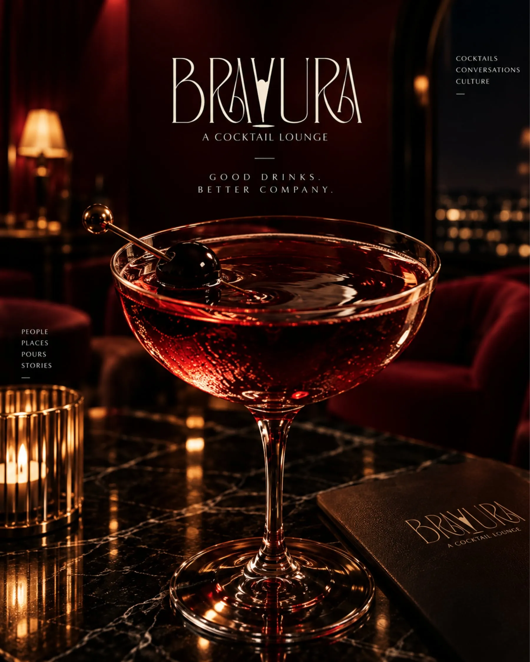
The mark in cream on a black-to-deep-red field, with a quieter “A Cocktail Lounge” line beneath.
Signage
The serveWeek 3
Where guests meet it
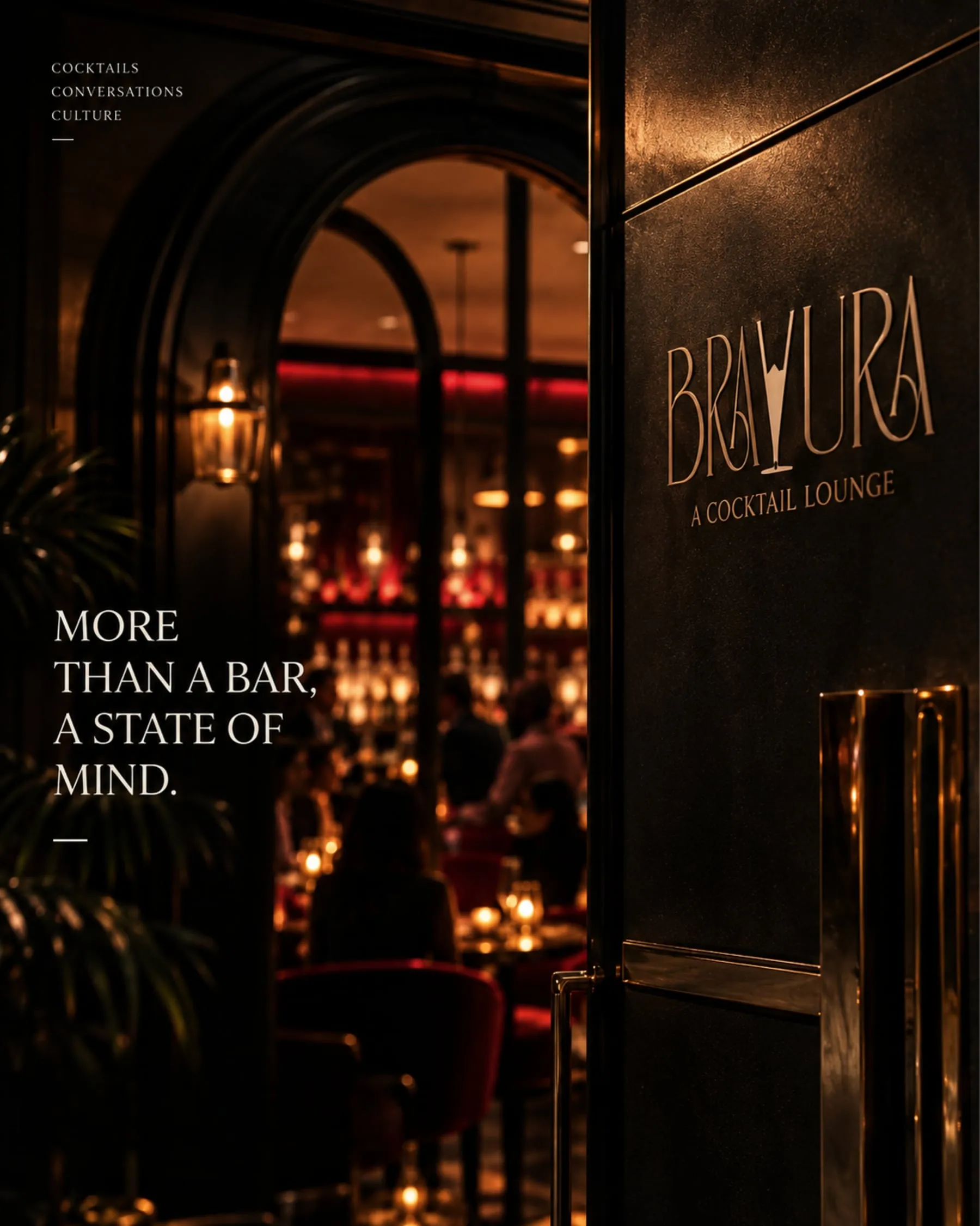
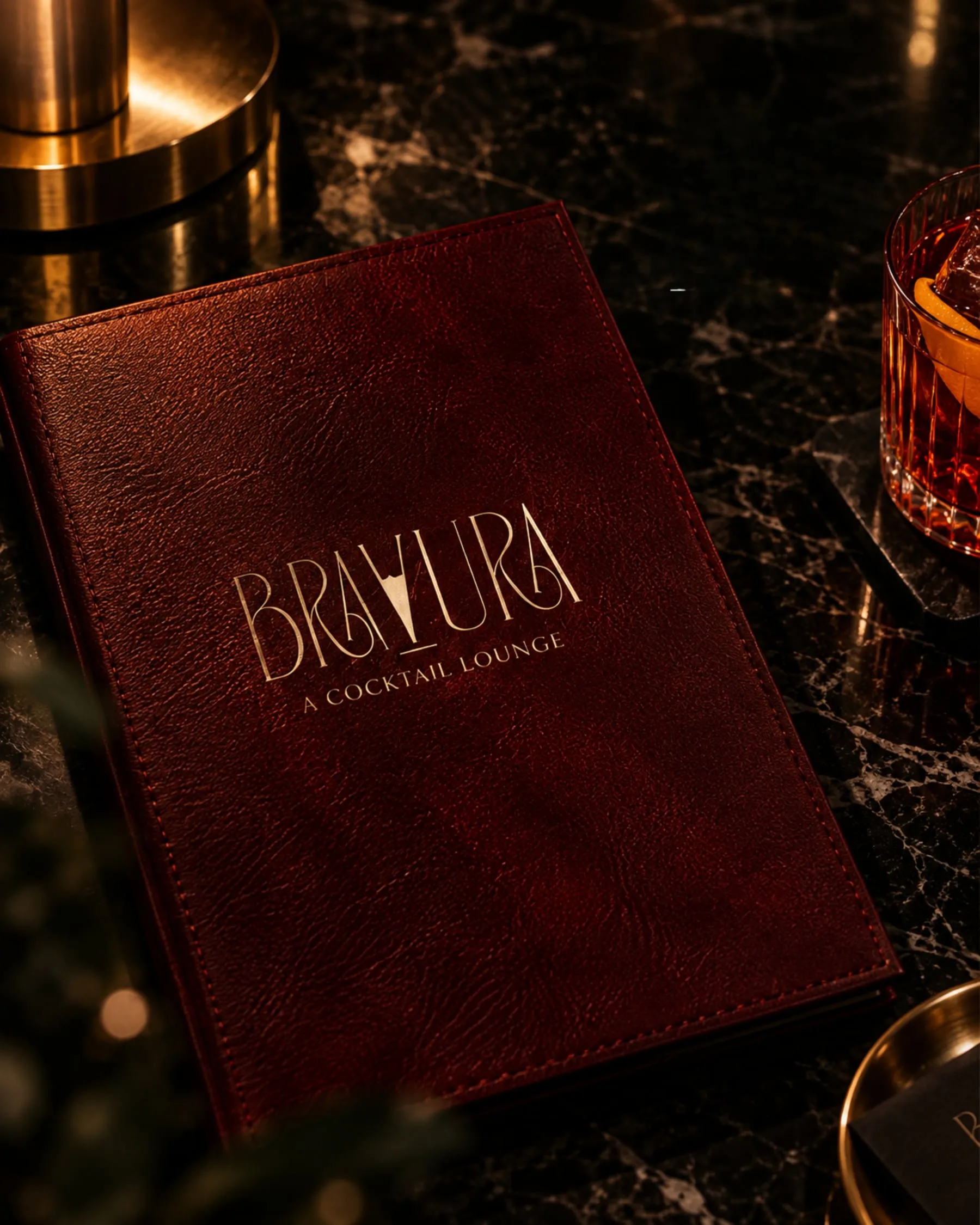
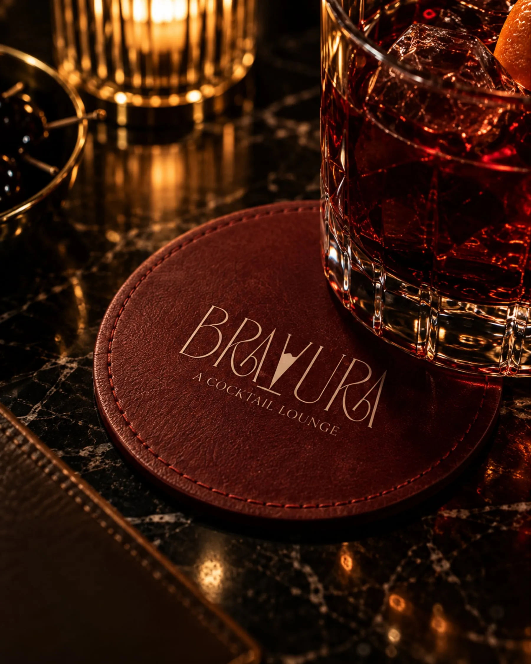
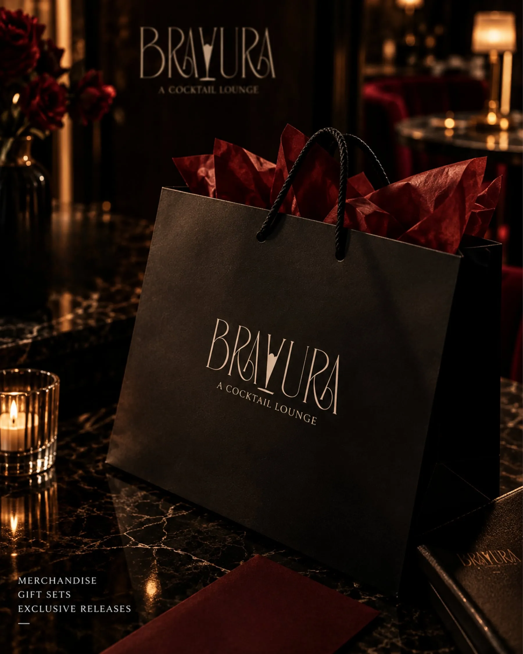
A poster, the door, a leather menu cover, a leather coaster and a black gift bag for merchandise, gift sets and exclusive releases.
Menu
Coaster
Gift bag
“Good drinks. Better company.”
“More than a bar, a state of mind.”
“Cocktails · Conversations · Culture”
The UX work
Behind the design
From the build — read off the real screens
Assumption — to validate with users
Planned test
From the build
01
The V of BRAVURA is drawn as a cocktail glass.
WhyThe name carries the venue’s purpose on its own — no icon needed beside it.
The mark
02
Slender, decorative capitals with art-deco curves.
WhyThey point to the golden age of the cocktail lounge, and read as an evening, not a pub.
The mark
03
A quieter descriptor, “A Cocktail Lounge”, sits beneath the name.
WhyThe name is bold and unusual; the line underneath removes any doubt about what the place is.
The mark
04
Cream on black and deep red, with warm light in every application.
WhyLow light and deep colour are the room itself; the mark stays legible in it.
Every application
05
The mark is pressed into leather on the menu and the coaster, rather than printed.
WhyTouch is part of the experience at a table; embossing feels considered.
Menu · Coaster
Assumption — to validate · A guest, meeting the brand through the night
Stage1Discover2Arrive3Order4Drink5Leave
DoingSees a poster or a postWalks up to the doorOpens the menuSets the glass downTakes something home
Thinking“That looks like a proper night out”“Am I in the right place?”“What should I have?”“—”“I’ll come back”
Feeling
positivepositivepositivedelighteddelighted
Pain—————
Design responsePoster: “Good drinks. Better company.”The mark on the door: “More than a bar, a state of mind.”A leather menu cover, embossed with the markA leather coaster carrying the mark at the tableA black gift bag for merchandise, gift sets and exclusive releases
Proto-personas — built from the brief, not from interviews
The evening guest
Out for a special night — a date, a celebration
Wants
A place that feels like an occasion
Frustrated by
Bars that all look the same
From the build — the information architecture as shipped
The mark
Wordmark — the V as a glass
Descriptor — “A Cocktail Lounge”
The palette
Black
Deep red
Cream
Print
Poster
Door signage
At the table
Menu cover
Coaster
Packaging
Gift bag — merchandise, gift sets, exclusive releases
The validation plan — how each assumption gets checked
We believePeople recognise the glass in the V without being told.