
Childcare · Sage Hill, Calgary, Canada · 2026
Where your child is known by name.
A parent-first website for a Calgary day care that answers the questions parents ask on the phone, and ends every page at a booked tour.
- 6:30 to 6open Monday to Friday
- 6 mo to 6 yrthe ages they care for
- 5rooms, by age and readiness
come spend a day with us →
-
6:30 amDoors openWeek 1
The most anxious choice a parent makes
Parents choose childcare largely from a website, before they ever visit. Most childcare sites read as a brochure or a compliance document.
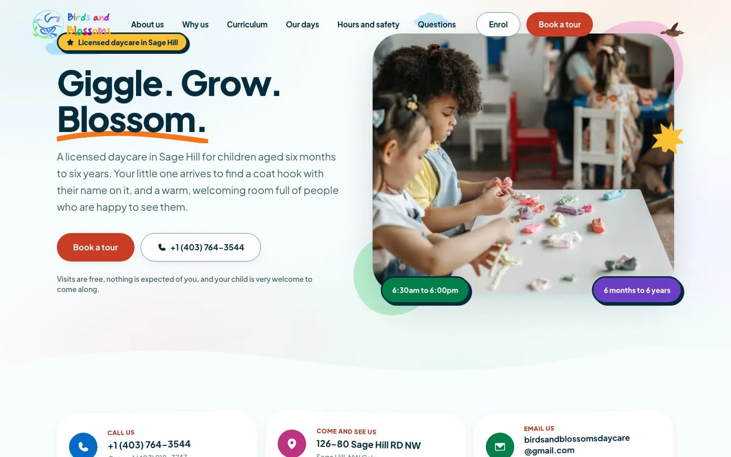
-
9:00 amCircle timeWeek 1
Answer what they ask on the phone
Who will be with my child, what will the day look like, and will anyone notice them? Every section answers one of those questions.
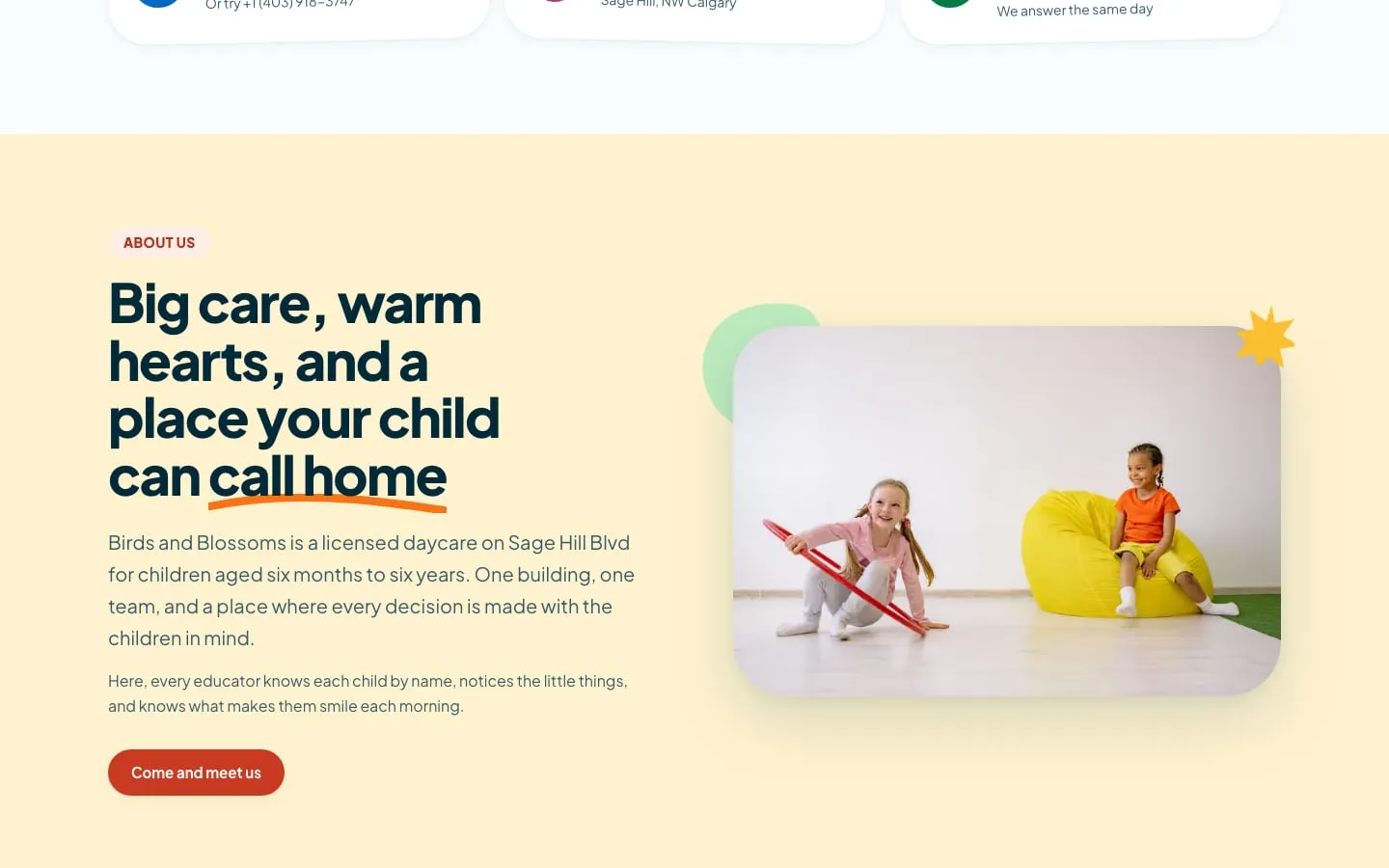
-
12:00 pmLunchWeek 2
A room for every age
Infants through kindergarten each get their own room on the site, so a parent can picture where their child would be.
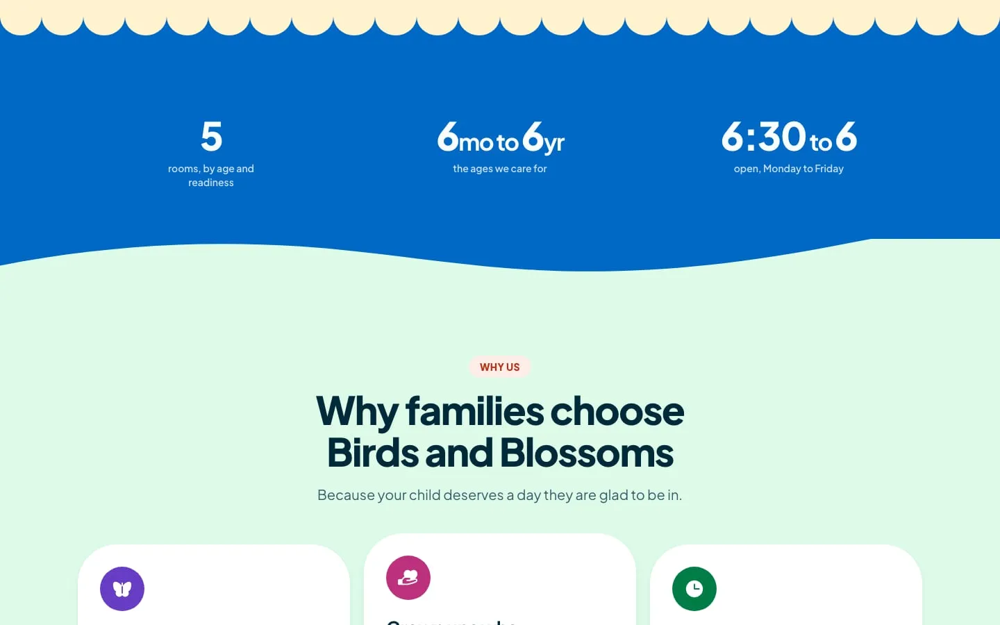
-
3:00 pmArt & messWeek 2
Calm, soft, real
Soft type, real photography and generous spacing keep the interface calm — written for the parent, not the regulator.
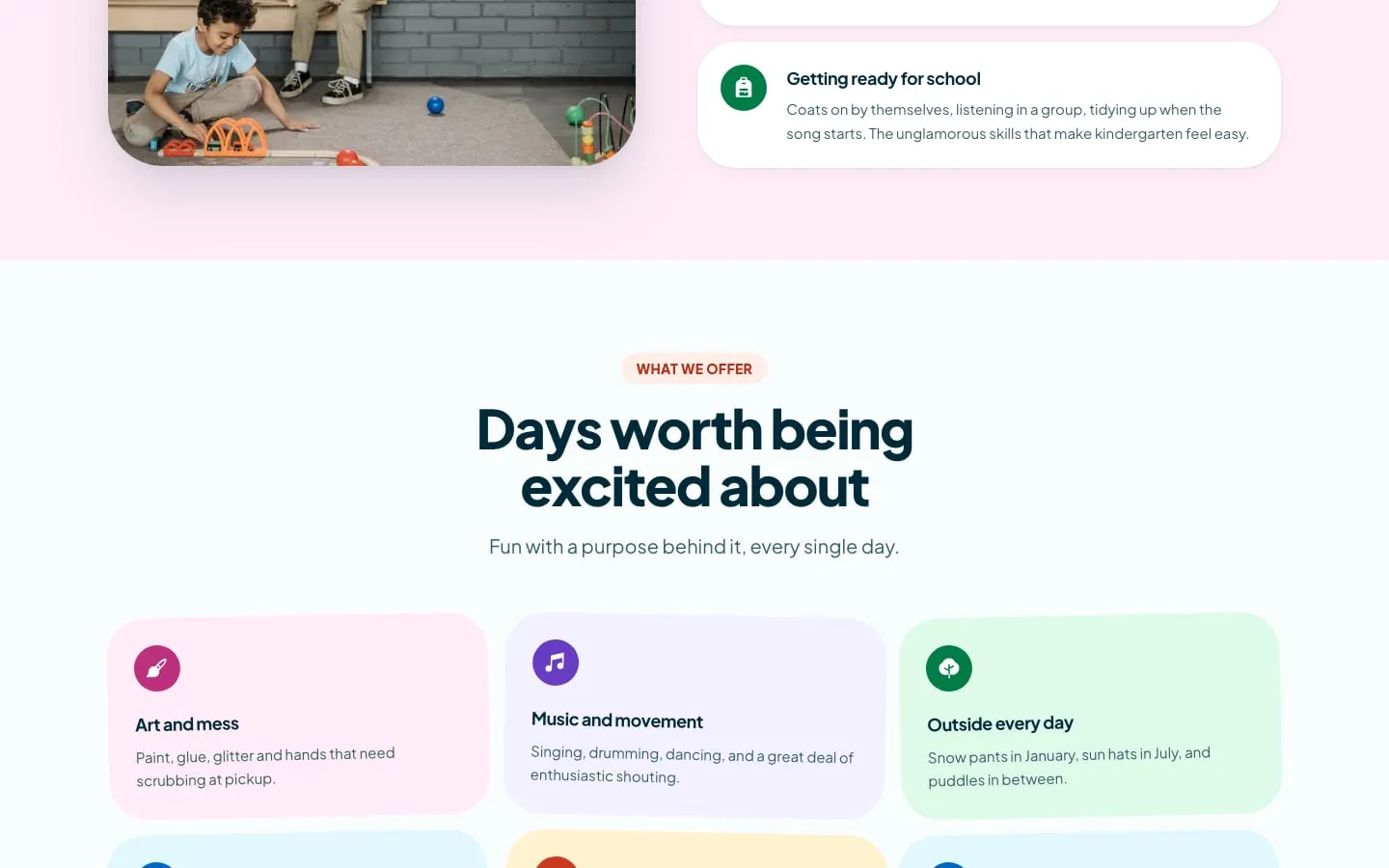
-
6:00 pmHome timeWeek 3
Every page ends at a tour
One next step everywhere: book a tour. Custom-coded with AI agents, hosted and deployed for an international client.

The UX work
Behind the design
- From the build — read off the real screens
- Assumption — to validate with users
- Planned test
From the build
- 01
Hours (6:30 to 6), ages (6 months to 6 years) and the five rooms are stated in the first screen.
WhyThey are the first three questions every parent asks; answering them up front saves a phone call.
Hero
- 02
Each section answers a question parents ask on the phone, in the parent’s words.
WhyWritten for the parent, not the regulator — reassurance is the product.
Every section
- 03
Book a tour is in the header and closes every section.
WhyParents decide in person; every page should lead there.
Header · Section ends
- 04
An application status page.
WhyThe anxious wait after applying is the moment trust is most easily lost.
Application status
- 05
Soft type, real photography and generous space.
WhyA calm interface signals a calm place.
Every page
Assumption — to validate · The returning parent
Proto-personas — built from the brief, not from interviews
-
The returning parent
Going back to work; looking for a first daycare for an infant
- Wants
- Know their baby will be safe and noticed
- Frustrated by
- Sites that read like compliance documents
-
The new family in Sage Hill
Just moved; needs a place for a preschooler
- Wants
- Compare options quickly and book a visit
- Frustrated by
- Having to call to find out hours, ages and spaces
From the build — the information architecture as shipped
- Home (one page)
- About us
- Why us
- Curriculum
- Our days
- Meals
- Hours and safety
- Questions
- Enrol
- Book a tour
- Application status
- Check an application
- Contact
- Phone in the header
- Address and hours
From the build — key flows, screen by screen
From search to tour
- 1Home
- 2Why us
- 3Our days
- 4Questions
- 5Book a tour
The validation plan — how each assumption gets checked
-
We believeParents can find hours, ages, meals and safety answers without calling.
MethodTask-based test with 5 parents of under-sixes
We’ll know byQuestions answered without leaving the page
-
We believeThe site makes parents more confident than a typical daycare site.
MethodSide-by-side preference test with two competitor sites
We’ll know byPreference and confidence rating (1–5)
-
We believeMore tours are booked through the site.
MethodAsk the centre to log how tour requests arrive for a month
We’ll know byShare of tours booked online
Home time
The whole site, top to bottom.

Sole designer and developer — UX research, UX and UI design, AI-assisted development with Claude Code, hosting and deployment.
Book a tour — the live site ↗Next project

The Knowledge Bus Global School
A school website that carries a very large amount of information — academics, admissions, campus, policies — without ever feeling like paperwork.