
Job posted · 2026
Post a job. Pick who you want. Get it done.
A two-sided marketplace that connects people who need work done with people ready to do it — designed end to end for both sides.
- The job
- Design a two-sided marketplace, end to end
- Platform
- Mobile app
- Duration
- 4 weeks
- Skills
- UX Research · UI/UX Design · Prototyping
Krishom SharmaSole designer — UX research, UX and UI design, and the interactive prototype.Approved ✓
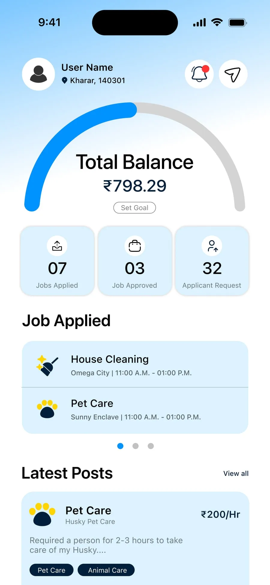
The job board · 4 weeks
Watch this project move through the app’s own lifecycle.
-
The job is posted
WorkMaster X is a two-sided marketplace. Someone posts a task — say, help moving to a new room — providers apply, and the poster chooses whoever they prefer. Two-sided marketplaces are hard: posters and providers each need flows that feel obvious. Posting a job, reviewing applicants and tracking work in progress all had to feel effortless on a small screen.
-
Two sides, one market
Who posts work, who does it, and what each of them needs to feel sure enough to tap “post” or “apply”.
-
Map both journeys
Posting a job and applying for one, mapped into clear paths — and a lifecycle with obvious states, so both sides always know what happens next.
-
Design the screens
A clean, friendly interface that keeps a genuinely complex marketplace simple to pick up — sign in, dashboard, job detail, posting, chat, profile.
-
Prototype and refine
An interactive prototype, used to test and refine the experience before build.
Two journeys, one app
Pick a side.
- 1Post the job
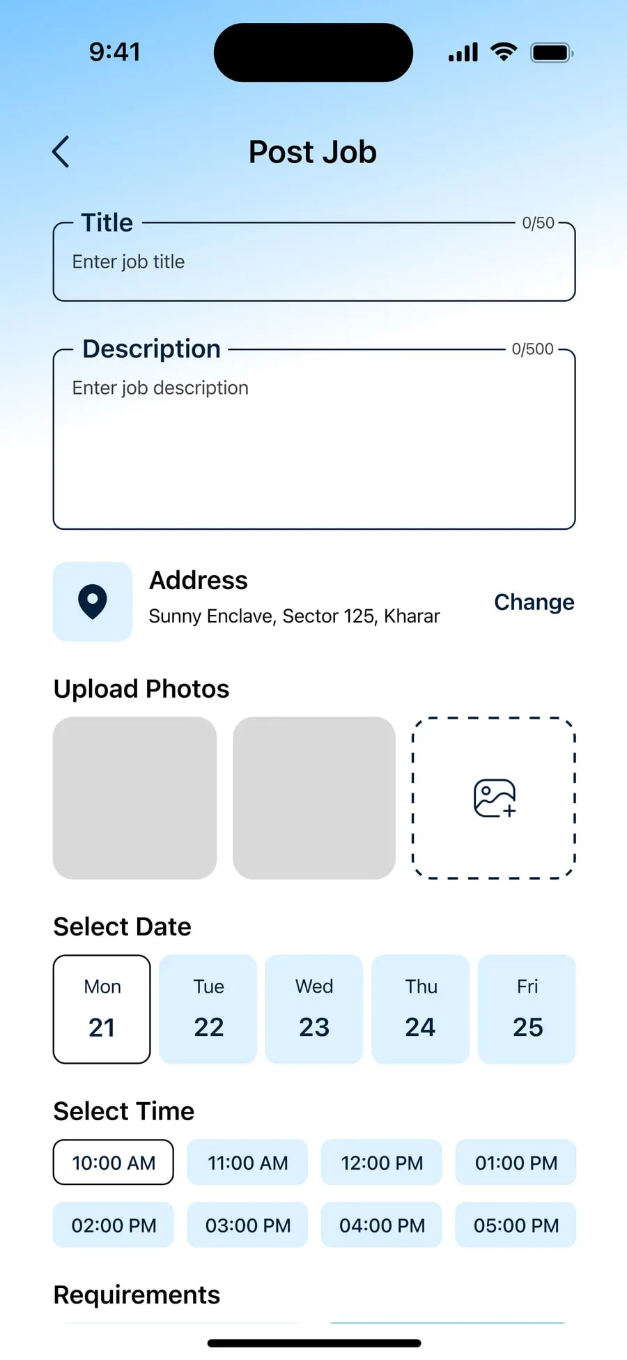
- 2Fill in the details
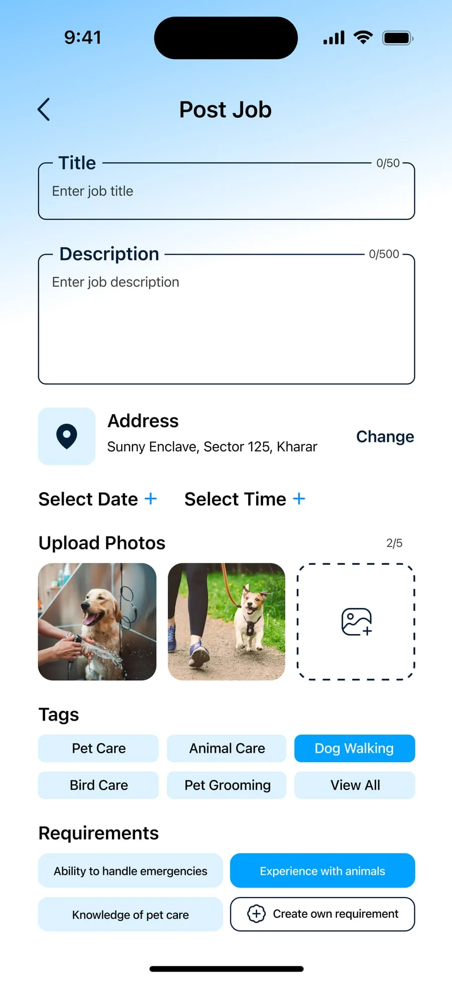
- 3Published
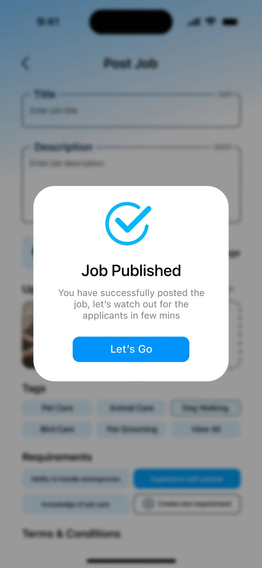
- 4Talk to applicants
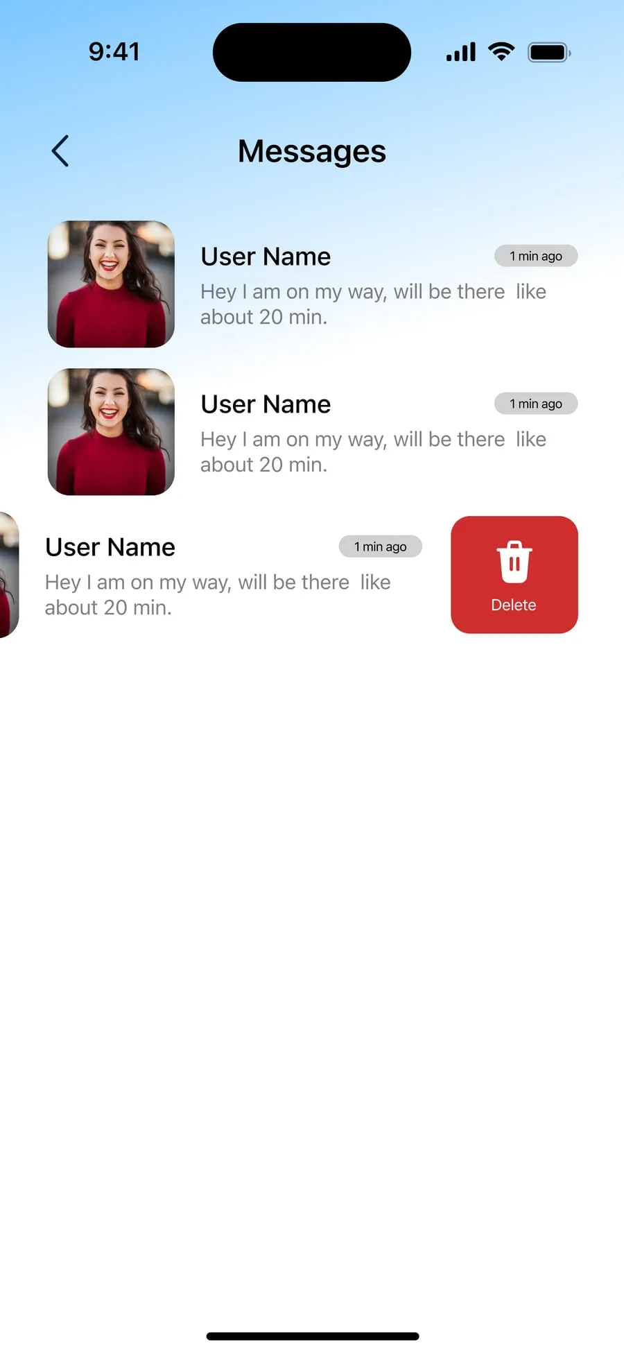
- 1Find work
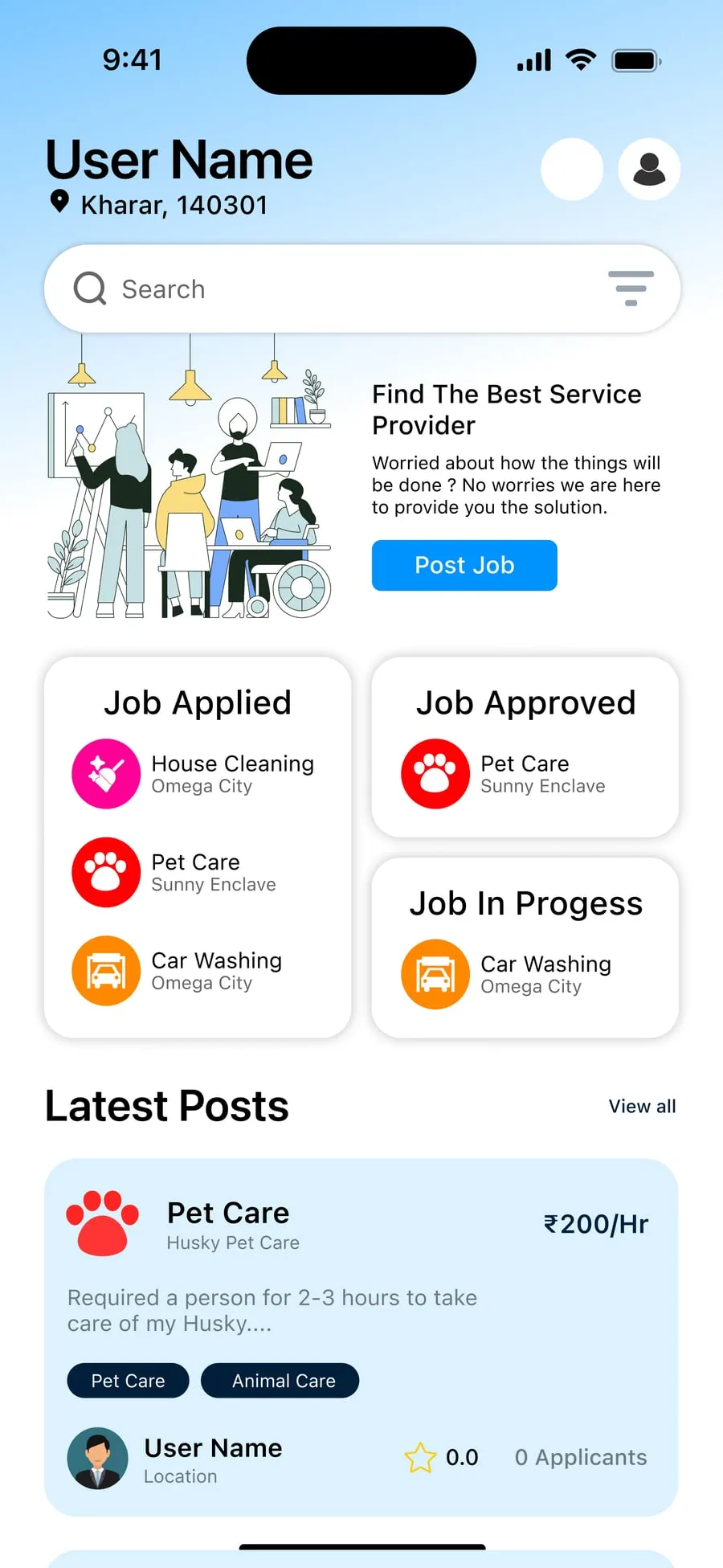
- 2Read the job
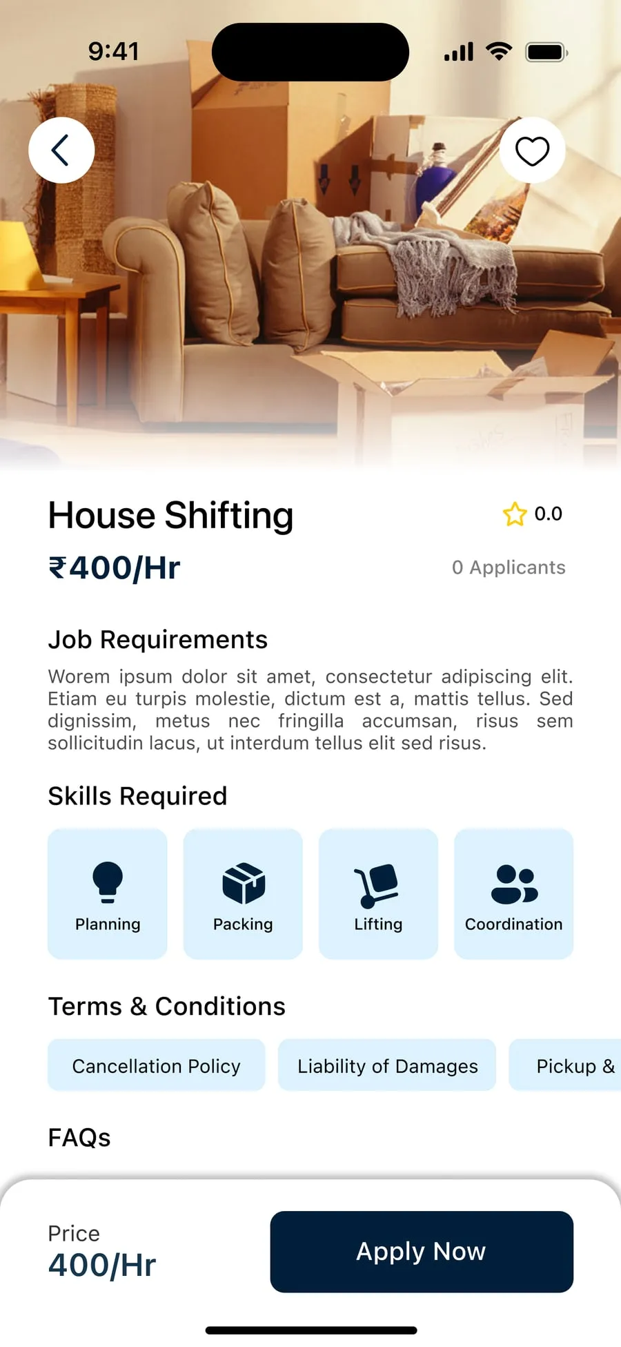
- 3Apply
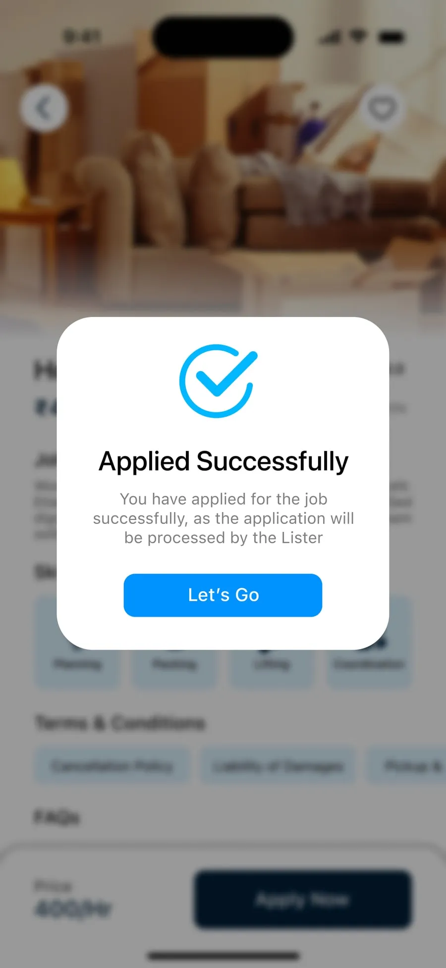
- 4Hear back
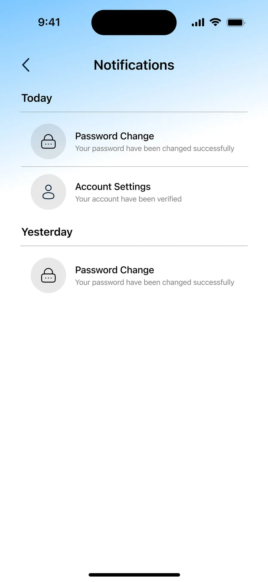
Every screen · 13
From sign-in to the last message.
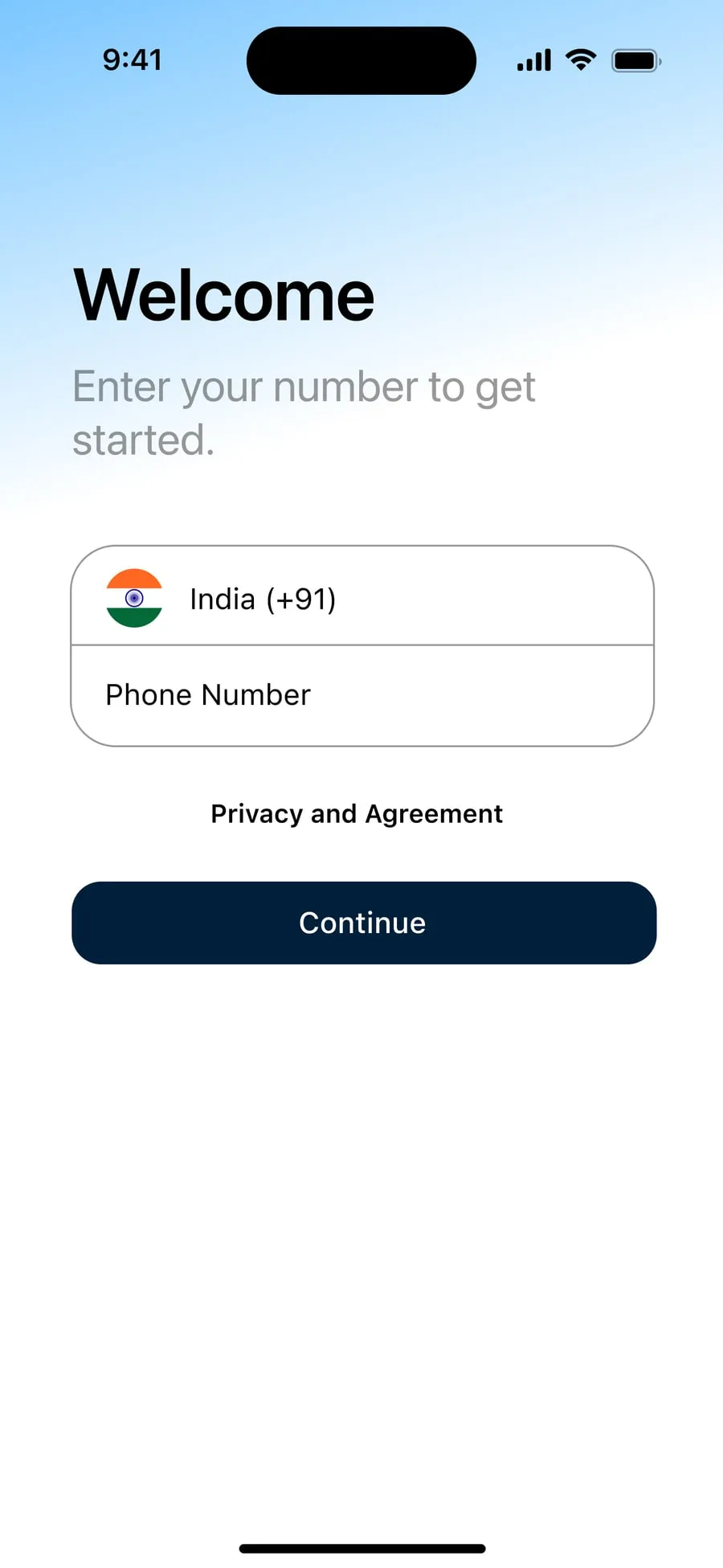
- Login
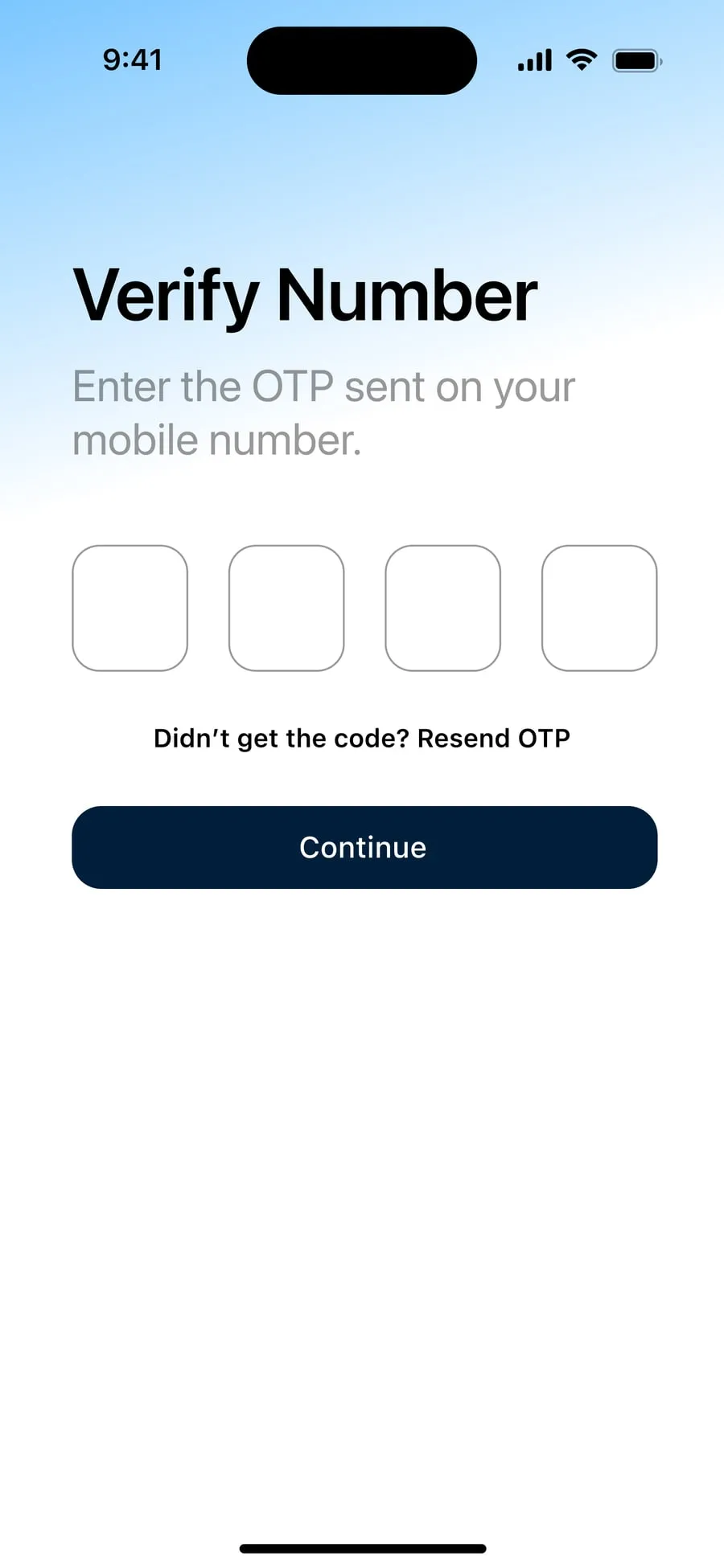
- OTP
- Dashboard
- Home
- All tags view

- Job detail
- Applied
- Job posting
- Job posting filled
- Job published
- Chat
- Notification
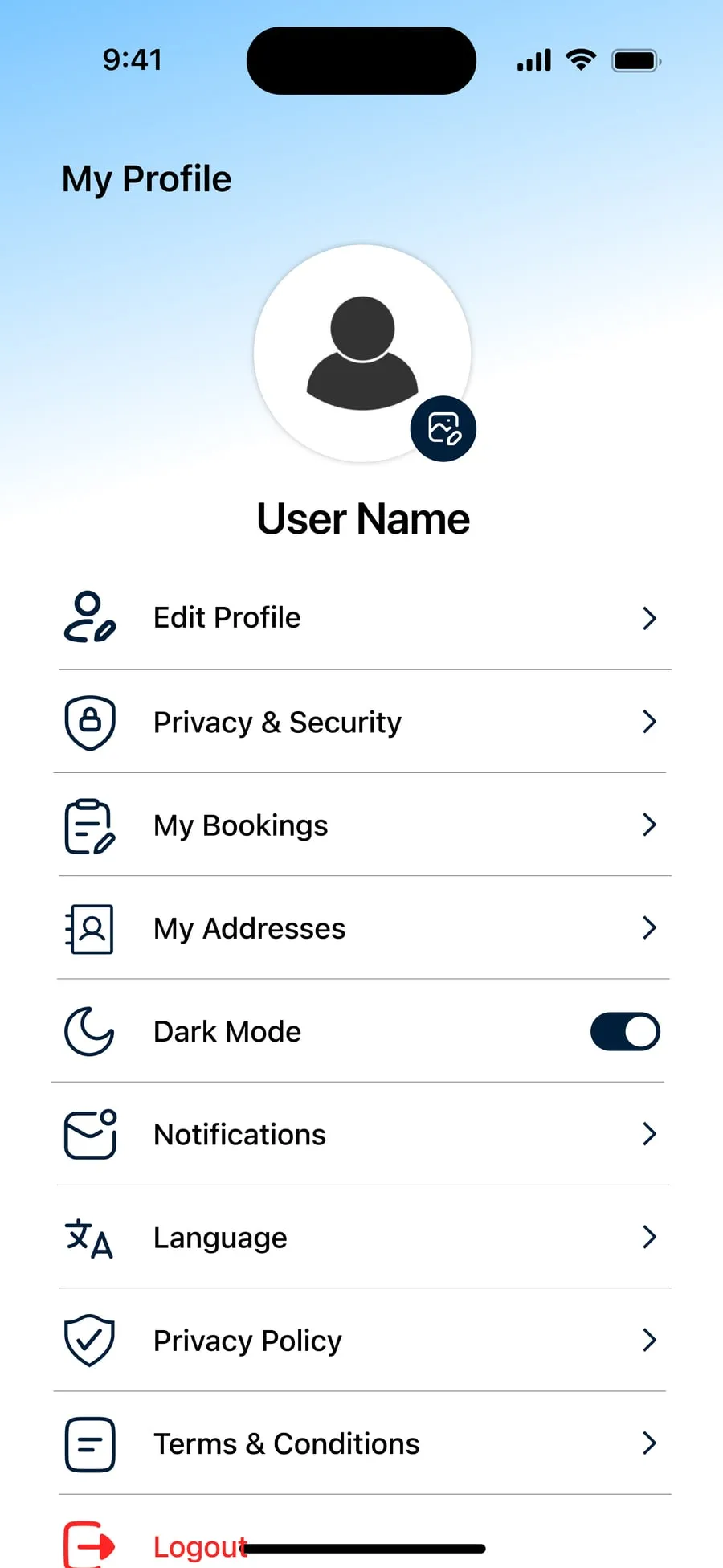
- Profile
The UX work
Behind the design
- From the build — read off the real screens
- Assumption — to validate with users
- Planned test
From the build
- 01
Sign-in is a phone number and a four-digit OTP — no password, no email.
WhyMany providers live on their phone, not their inbox; every extra field is a reason not to start.
Login · Verify number
- 02
The home screen groups your work by state: Job Applied, Job Approved, Job In Progress.
WhyIn a two-sided market the anxious question is “where does it stand?” — the lifecycle is the navigation.
Home
- 03
The hourly price leads every job card, and on the job page it stays pinned beside Apply Now.
WhyPay is the deciding fact for a provider; it should never scroll out of view at the moment of deciding.
Latest Posts · Job detail
- 04
Posting a job is one screen of chips: dates, time slots, tags and requirements are tapped, not typed — with “Create own requirement” for the rest.
WhyTyping is the slowest thing on a phone; structured chips also give providers jobs they can compare.
Post Job
- 05
Limits are shown before they bite: 0/50 for the title, 0/500 for the description, 2/5 photos.
WhyPeople write to the space they are given; showing it prevents errors on submit.
Post Job
- 06
Every commitment ends in a confirmation with one next step — “Job Published”, “Applied Successfully”, each with Let’s Go.
WhyClosure plus a clear next move removes the “did that work?” moment.
Job Published · Applied
- 07
Language and Dark Mode sit in the profile, not buried in settings.
WhyA local marketplace serves a broad audience; both affect whether the app is usable at all.
My Profile
Assumption — to validate · The poster, getting a house shifted
Proto-personas — built from the brief, not from interviews
-
The poster
A busy local who needs something done this week — moving house, walking the dog
- Wants
- Find someone reliable at a fair hourly rate without phoning around
- Frustrated by
- No way to tell who is trustworthy; prices vary wildly
-
The provider
A local worker or student taking on tasks by the hour
- Wants
- Steady work nearby, with the pay clear up front
- Frustrated by
- Vague job posts, and never hearing back after applying
From the build — the information architecture as shipped
- Sign in
- Phone number (+91)
- Verify number (OTP)
- Home
- Search & filter
- Post Job
- Job Applied
- Job Approved
- Job In Progress
- Latest Posts
- Dashboard
- Total balance
- Jobs applied
- Jobs approved
- Applicant requests
- Jobs
- Tags — Pet Care, Shifting, Cars, Home, Party
- Job detail
- Apply
- Post a job
- Title & description
- Address
- Date & time
- Photos
- Tags
- Requirements
- Messages
- Conversations
- Swipe to delete
- Notifications
- Today
- Yesterday
- Profile
- Edit Profile
- Privacy & Security
- My Bookings
- My Addresses
- Dark Mode
- Notifications
- Language
- Policies
- Logout
From the build — key flows, screen by screen
Posting work
- 1Home
- 2Post Job
- 3Fill in the details
- 4Job Published
- 5Messages
Doing it
- 1Verify number
- 2Home
- 3Select tags
- 4Job detail
- 5Apply Now
- 6Applied Successfully
The validation plan — how each assumption gets checked
-
We believeA poster can publish a complete job in under two minutes.
MethodModerated usability test, 5 people who have hired help locally
We’ll know byTime on task; fields left empty; errors
-
We believeProviders can tell, from the home screen alone, which of their jobs are approved.
Method5-second test + follow-up question
We’ll know byShare who identify the approved job correctly
-
We believeA pinned price beside Apply makes the decision faster than a price in the description.
MethodFirst-click test on two versions of the job page
We’ll know byTime to first click on Apply; confidence rating
✓ Done
Job complete.
Both sides designed end to end — posting, applying, approving and tracking — in an interactive prototype.
- UX Research
- UI/UX Design
- Prototyping
Next project

FitOra
A personal fitness dashboard that syncs data from wearables and turns steps, workouts, calories and sleep into one organised view — in dark and light modes.